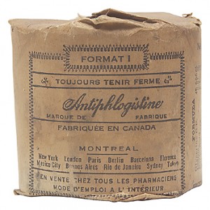
 If you don’t speak French and/or have aging eyesight, you might not understand the label on the medicine in the photo.
When someone doesn’t understand the label placed on their prescription drug, they’re in a compromising position: this lowers health literacy and potentially endangers peoples’ health.
As I monitor the tweets from today’s meeting of the Business Development Institute’s (BDI) Mobile Healthcare Communications conference, covering statistics and case studies about who’s using smartphones for accessing health information and how pharmaceutical companies can bolster adherence by developing mobile health apps, I’m struck by an important story in the health news that won’t get much coverage because it’s not about a Shiny New Thing: prescription drug labeling.
The U.S. Pharmacopeia (USP) comes to the rescue with a simple idea: let’s simplify and clarify prescription drug labels. We’re talking basic Health Literacy 101 here — no 2.0 or 3.0 version of disruptive technology. USP offered, for the first time, standards that result out of the Institute of Medicine’s recommendations to improve health literacy in the U.S. The standards are now available for comment for 90-days on the USP website.
USP is concerned that as new patients enter the health system, combined with growing diversity in the U.S., health citizens won’t be well-armed to understand the typical prescription drug container label. Often these are the only instructions a patient has once they leave the pharmacy with a prescribed drug in-hand.
The standards recommend that prescription drug labels:
- Are organized in a patient-centered way
- Emphasize instructions and critical information for taking the drug
- Offer explicit instructions which separate the dose of the drug from the timing of each dose (e.g., not “Take two tablets twice daily,” but instead, “Take 2 tablets in the morning and 2 tablets in the evening”)
- Include the purpose for the prescription in plain language (e.g., “for high blood pressure” vs. “for hypertension)
- Improve readability (using larger font type)
- Limit extraneous information that’s not necessary from the core messaging.
USP consulted with a broad array of industry experts including representatives from the fields of health literacy, retail drug chains, patient safety, pharmacy, and other areas.
Health Populi’s Hot Points: There’s a related story in this week’s JAMA called A Vision for Patient-Centered Health Information Systems that dovetails nicely into the USP recommendations. The authors, Dr. Alex Krist and Dr. Steven Woolf, talk about the state of the art of personal health records with the bottom-line that they’re not yet ready for prime time. Krist and Woolf find that no existing PHR has all the capabilities required to help patients:
- Collect patient information
- Integrate patient information with clinical information through links to an EHR or claims data
- Interpret clinical information for the patient into lay language via a user-friendly interface
- Provide individualized recommendations to the patient (e.g., screening reminders based on risks noted in the record), and
- Activate patients to make informed decisions.
In fact, the doctors believe, “Personal health records that lack this sophistication are potentially harmful at every level of functionality.”
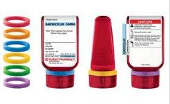 Keeping things simple in health care can result in beautifully executed design, like Target’s Clear Rx pill bottle, pictured here, which won IDSA’s Design of the Decade award last year. Read more about this innovation in Health Populi here.
The USP standards recommendations speak to the importance of design at the most basic level — for communication. This can lead to patient empowerment and bolster health literacy and improved health outcomes and appropriate utilization of health system resources and dollars.


 Thank you, Jared Johnson, for including me on the list of the
  I am so grateful to Tom Lawry for asking me to pen the foreword for his book, Health Care Nation,
  Thanks to Feedspot for naming this blog, Health Populi, as a